BRUCE BLOG / ENGINEERING
One night with iPhone Duo: measure first, then let the system lead
Two displays, one hinge, six poses, and screenshots due by April 2027. We measured the Bruce iPhone app in every state, removed its drawn headers, kept content off the fold, and wrote down every wrong turn.
Yang Yong’an + Claude Code · Published · Originally recorded
A new form factor with a deadline
iPhone Duo reached customers on October 23, 2026. It folds like a passport: closed, you use the outer cover display; open, a larger inner display; and it can stand half open on a table. Apple's developer news is direct about it: recompile with Xcode 27.1, check every pose and orientation, and submit iPhone Duo screenshots, and the product page shows that the app is optimized for iPhone Duo. Starting April 2027, submissions need Duo screenshots.
Bruce's iPhone app is a remote for the agents on your computer: read sessions, answer questions, approve actions, open a terminal. It was laid out for one rectangle per device. This is how we and Claude Code adapted it to the new display in one evening: measure, decide, then verify state by state.
The screenshot sizes are in the specification: the outer display at 1398 × 2034 or 2034 × 1398 pixels, the inner at 2007 × 2853 or 2853 × 2007. They are exactly the Simulator's two displays.
Measure all six states first
We changed no code at first. We added a debug probe that reads the window, orientation, size classes, safe area, and the reserved regions and hinge state that iOS 27.1 adds. An app cannot turn itself on the Duo, and the Simulator cannot be folded from the command line, so a person folded and turned it while a small script read the probe every two seconds and saved the readings and a screenshot whenever the state changed.
Some readings surprised us. Folded, the status area is an 84 × 174 rectangle in the top corner, yet the safe area gives up the whole edge. Half open, the hinge is a 40-point division with 20 points on each side of the fold; fully open, the division is still reported, only inactive. One fact mattered later: even with the window on the inner display, UIScreen.main reports the 466 × 678 cover display.

First wrong turn: reclaiming the empty strip
Folded and upright, the app used 382 of the display's 466 points; the strip under the status area stayed empty. Our first reflex was to run the lists into it. Alignment broke, and Apple's iPhone Duo design guidance explained why: that strip is where the system puts toolbars and tab bars on the outer display.
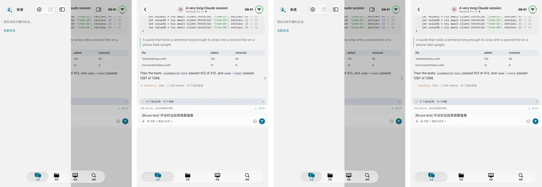
The real problem was our drawn header: segmented tabs, search and a new button across the top, leaving the system nothing to place on the side. We reverted that night and moved to the system's TabView and toolbars: Conversations, Projects and Devices, plus a system search tab, each with its actions as toolbar items. Folded, the system lays them down the trailing strip by itself.
It also settled a rule we now apply everywhere: each platform's own way first. A native feel and the platform's features come before making the phones look alike; concepts, words and behavior stay one product, and the chrome follows each platform.


Tabs are navigation, not tools
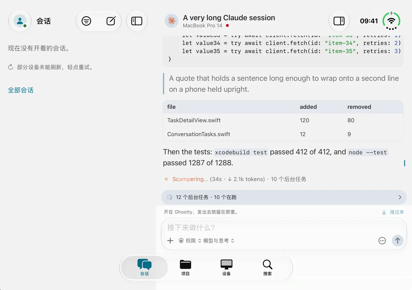
On the inner display held landscape, the system also turned the tab bar into a column of icons on the right. Looking at the screenshot, the product call was quick: the three tabs are the app's navigation, and without their labels they lose their meaning; they are not tool buttons. We looked at how large apps handle wide screens and tried the system's sidebarAdaptable sidebar first. Once collapsed, it offered no way back, and remembered that state.
The final choice is more restrained: where the window is wide and not split at a hinge, iOS 27.1's toolbarVerticalBehavior(.disabled) keeps the bars horizontal, and the tab bar returns to the bottom with its titles. The cover display and the half-open split keep the system's side bars.
Hand page headers to the system bar
Next came the pages. The session page also drew its own header: Back, an avatar, the title and a few buttons in one row across the top. In the system bar, the avatar and title are now the principal item, and tapping the title still opens the agent, the project and the computer; Back, the terminal and the side pane are bar items, which go down the side with the system's bars on the cover display.
Three surprises came with it. First, the detail column's bar stood empty: the page's toolbar sat inside an .inspector and never reached the navigation bar, so the inspector moved outside the stack. Second, the transcript is an upside-down scroller, for scrolling performance on long sessions, and cannot use the system's scroll edge effect, so text showed through the bar. A bar background was not enough: with side bars the title's band floats 14 points below the top, and the text stayed sharp above it. We fixed it at the source, with a mask that stops the transcript under the top bar while it still runs under the box at the bottom. Third, the side pane's on and off state became the system's toggle button.
Half open: read above, touch below
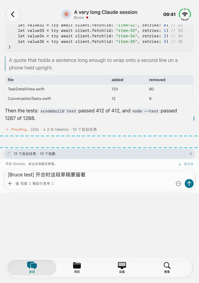
Half open and upright, the hinge crosses the window between 456 and 496 points. We wrote a FoldedColumn: the transcript ends above the fold, and the background-task strip, the question trays, the box and the terminal's keys start just under it. There is only ever one structure, and only its sizes change with the hinge, so folding never loses the transcript or its scroll position.
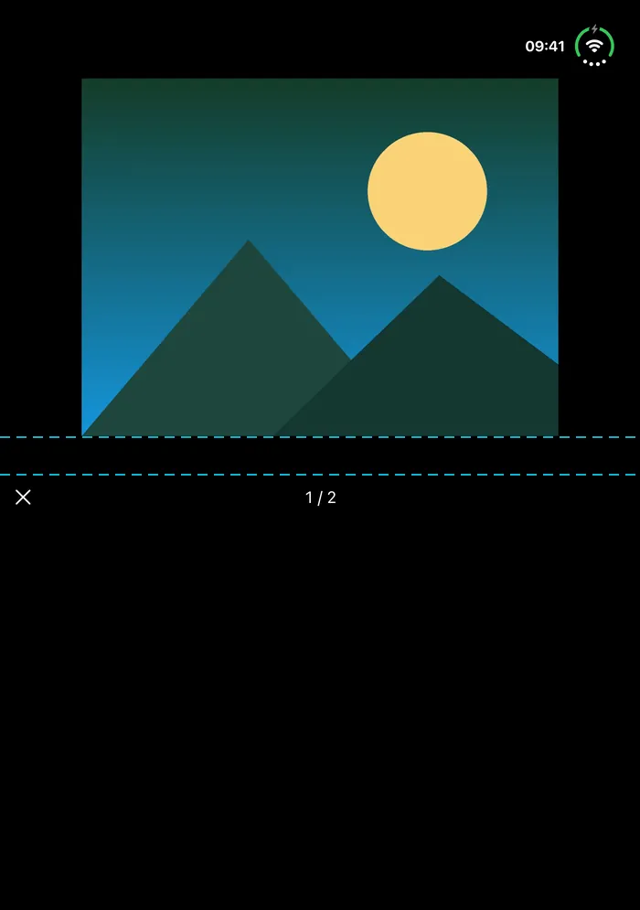
The photo viewer centered its photo, right on the fold. Now the photo sits above it, with the close button and the count just below. Half-height sheets needed nothing from us: measured, the system already places their top edge at 487.5 points, under the fold.
A Simulator without a keyboard, and a stand-in
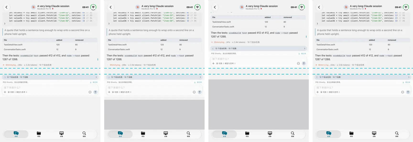
Does the box still fit under the fold once the keyboard is up? That needed measuring, but this Simulator runs headless: focusing a field brings up no software keyboard, and there is no window for Command-K. So the debug channel gained a stand-in keyboard that takes a given height off the bottom of the page, the way the keyboard's safe area does.
At 200 points the box stays under the fold; at 336 there is no room, and it rises to sit just above the fold. The first version got this wrong: it measured its own height as the sum of its parts, kept the old value when the keyboard came up, and pushed the transcript behind the title bar. Measuring the room it is given fixed it, and all four states passed again.
The window, not the screen
The keyboard hid an older problem. The code compared the keyboard's position with the height of UIScreen.main to decide whether it was up. On the Duo, the main screen is the 678-point cover while the window is on the 951-point inner display: a keyboard on the inner display with its top at 700 read as down.
The fix uses the screen that comes with the keyboard's own notification and converts the frame into the points of the window it covers. To check it, the debug channel can now send a keyboard notification, and a keyboard at 700 reads as up. The other code using the main screen, a preview zoom width, turned out to have no caller and was deleted. The app no longer uses UIScreen.main at all.
Fold mid-use, and the page follows
Folded and open upright are narrow layouts, with pages pushed on the list's stack; open in landscape is wide, with the page beside the list. What happens if you fold or open the device in the middle of a session? A debug switch that flips between wide and narrow showed two problems. Widening left a pushed page in the 360-point list column with the detail empty. Narrowing collapsed the split onto its detail, and the system bar showed Back but lost the page's title.
Now a page always lives where its width puts pages: widening moves it into the detail, narrowing moves it back onto the stack. While a terminal is open over it, it stays put until the terminal closes. The connection belongs to the shell, not the page, so nothing reconnects; there and back twice, the session on screen and the draft in the box were still there.
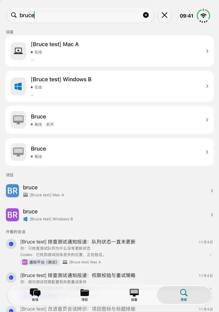
Search, finished along the way
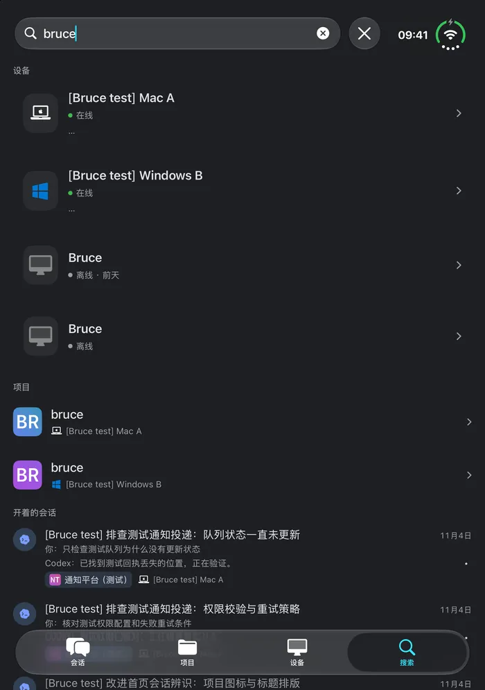
With the home on system tabs, search became the system's search tab: one field across devices, projects and conversations, results grouped under each tab's name, each group drawn with that tab's own rows. Devices and projects match on the phone as you type; conversations are each computer's own search, asked a moment after the last key. When nothing matches anywhere, the system's own no-results view appears.
Make every state measurable
The most useful result of the night was not any single fix but the tools that made each state measurable. With no device in hand and a Simulator that cannot be folded from a script, these debug switches took us to every state, and each conclusion came with a screenshot and a set of readings.
- A probe: the window, size classes, safe area, occlusions, the division and the hinge in one reading.
- A side-bars switch: the system's vertical bars on the inner display, as when folded.
- A fake hinge: an active division on any display, set at launch.
- A stand-in keyboard and a keyboard notification: the keyboard measured on a Simulator that has none.
- A width switch: wide and narrow layouts, as folding would change them.
- One capture script: nine pages, light and dark, in the current state.
- Source locks: no UIScreen.main, the division read from the system, pages moving with the width. Each decision is guarded by a test.
What is not done yet
We ran the full capture only in one real state, half open and upright. Folded, open flat in both orientations, and half open in landscape still need someone to set the device and run it again. Folding mid-dictation is expected to stop the dictation, since the box is drawn again when the page moves; folding mid-terminal, and the terminal and file pages, need a live computer.
The build side of the badge is met: Bruce builds with the iPhoneOS 27.2 SDK, supports portrait and both landscapes, and does not require full screen. What remains is a set of screenshots with real content for each display, uploaded in App Store Connect.
A checklist for other teams
If you are working toward the same April 2027 deadline, this is the order we would follow again.
- Rebuild with the iOS 27.1 SDK or later; check full-screen settings and supported orientations.
- Measure all six states before changing anything, and keep the numbers with the screenshots.
- Replace drawn headers and tab strips with system bars, and let the system place them on each display.
- Read the division in the view that lays out around it; while it is active, keep text and controls off it.
- Take sizes from the window and the view's geometry, never UIScreen.main.
- Decide where a page lives at each width, and move it when the width changes mid-use.
- Keep the system's sheet placement unless you measure a problem.
- Capture the outer and inner displays at their native sizes for App Store Connect.